Brand Guidelines
This guide defines the visual language, design style, and principles that shape a clear and consistent brand experience, no matter the team or area of expertise.
At its core, GrowWell is about growth and positivity—just like our mission to empower young learners in developing resilience and emotional well-being. This guide lays out the essential design standards that bring our brand to life, from our color system and typography to accessibility benchmarks and documentation.
Whether you're designing for digital platforms or printed materials, these guidelines ensure every touchpoint reflects the trust and warm accessibility at the heart of GrowWell.
Contents
01 Brand Strategy
02 Personality
03 Logo
04 Color
05 Typography
06 Art Direction
01 Brand Strategy
In today’s rapidly changing world, early childhood education faces a critical turning point. We are witnessing rising mental health concerns among our youngest children . Educators are often overwhelmed, facing burnout without the right resources to manage emotional development in the classroom . Parents, though eager to help, often lack the tools to navigate these complex conversations at home .
The result? A fragmented system where children struggle to articulate their feelings, and the adults guiding them feel ill-equipped to help. The status quo of working in silos—where schools and homes operate separately—is no longer sufficient .
GrowWell was born from a simple, powerful belief: Well-being is foundational for everyone.

We believe that a child’s healthy development cannot happen in isolation. It requires the simultaneous empowerment of the entire ecosystem: the child, the educator, and the parent . We don't just teach children; we build a "Culture of Care" around them . Our philosophy is rooted in prevention—addressing mental health proactively rather than reacting to crises later in life .
We are not just an educational project; we are a movement toward a more resilient society. Our brand balances expert reliability with warm accessibility . We are safe, trustworthy, and grounded in research, but we are also colorful, enthusiastic, and full of life.
When you interact with GrowWell, you are stepping into a partnership. We promise to deliver practical tools that foster trust and dialogue . We promise to help you navigate the complexities of emotional growth with confidence.
02 Personality
GrowWell’s voice is Respectful: Above all else;
Balanced: Walking the line between Serious (expert) and Funny (engaging);
Style: Slightly Casual and Enthusiastic to remain approachable.
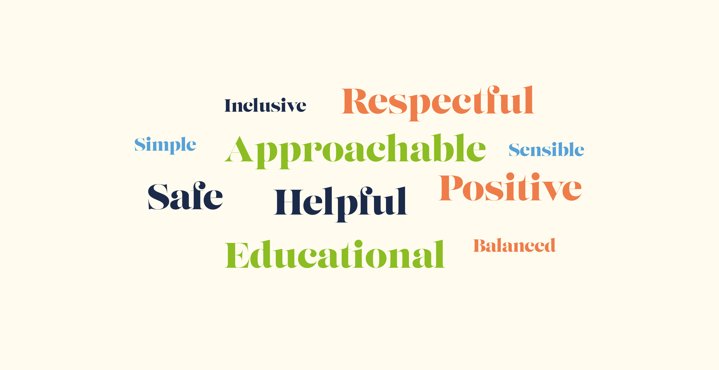
Tone & Voice
Our Vision: why we exist
A society where well-being is foundational for everyone.
Our Mission: what we do
To foster a generation of confident, resilient, and mentally healthy individuals by equipping all stakeholders (educators, parents, and children) with essential skills in communication, emotional intelligence, and self-respect.
Our Promise: how we help
We are not just an educational project; we are a movement toward a more resilient society. Our brand balances expert reliability with warm accessibility . We are safe, trustworthy, and grounded in research, but we are also colorful, enthusiastic, and full of life .
When you interact with GrowWell, you are stepping into a partnership. We promise to deliver practical tools that foster trust and dialogue . We promise to help you navigate the complexities of emotional growth with confidence.
Sample Copy
Our ultimate destination is a world of confident, resilient, and mentally healthy individuals .
Our ultimate destination is a world of confident, resilient, and mentally healthy individuals .
We envision a future where every child has the vocabulary to speak about their emotions, where every educator feels supported in their vital work, and where every parent feels equipped to nurture happiness at home.
For the parent
We offer trustworthy guidance and workshops that demystify mental health, turning parents into confident partners in their child’s emotional growth .
For the Educator
We provide expert, ready-made didactic resources and digital tools that integrate seamlessly into daily routines, reducing stress and fostering a supportive classroom environment .
For the Child
We offer "Hero’s Journey" animations and outdoor activities that make learning about emotions fun, granting them the agency to understand and express how they feel .
03 Logo
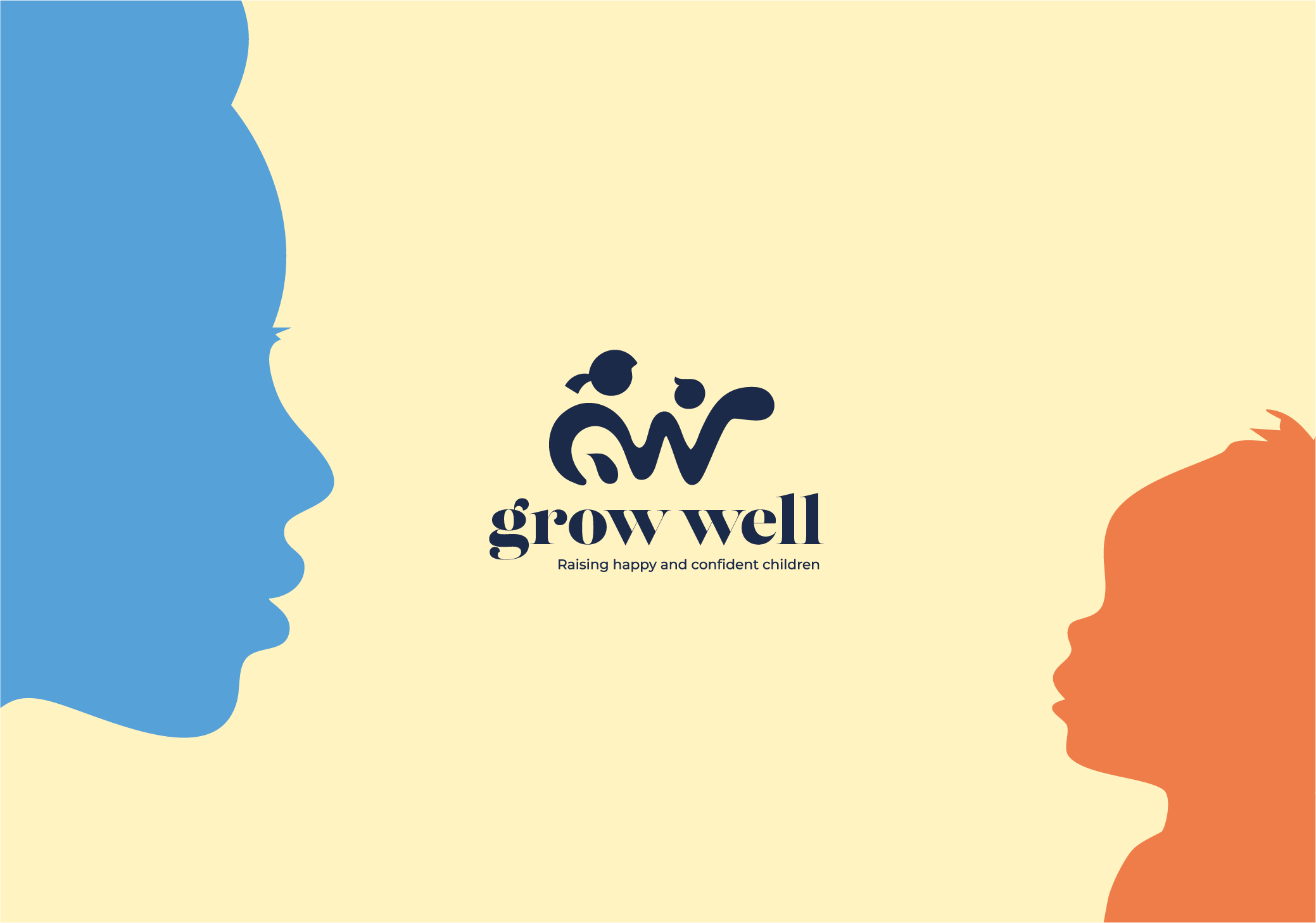
The GrowWell logo centers on a fluid brandmark that intertwines two abstract figures—a larger form representing the educator or parent and a smaller one for the child—to symbolize partnership and care. These shapes cleverly form the initials 'g' and 'w' in an organic style that visualizes the brand's core mission of growth and connection.
Complementing this symbol is a modern, lowercase wedge-serif wordmark that balances professional trust with friendly accessibility, using bolded initials to create a unified visual lockup. The design is anchored by a vibrant palette: "Rich Navy" and "Power Blue" establish expertise, while "Vibrant Lime" and "Bright Tangerine" infuse the brand with essential vitality and warmth.
Primary Lockup
Secondary lookup
Without tagline
Dark
Icons
Incorrect Usage
Do not resize the mark
Do not rotate the logo
Do not change the color of the mark alone
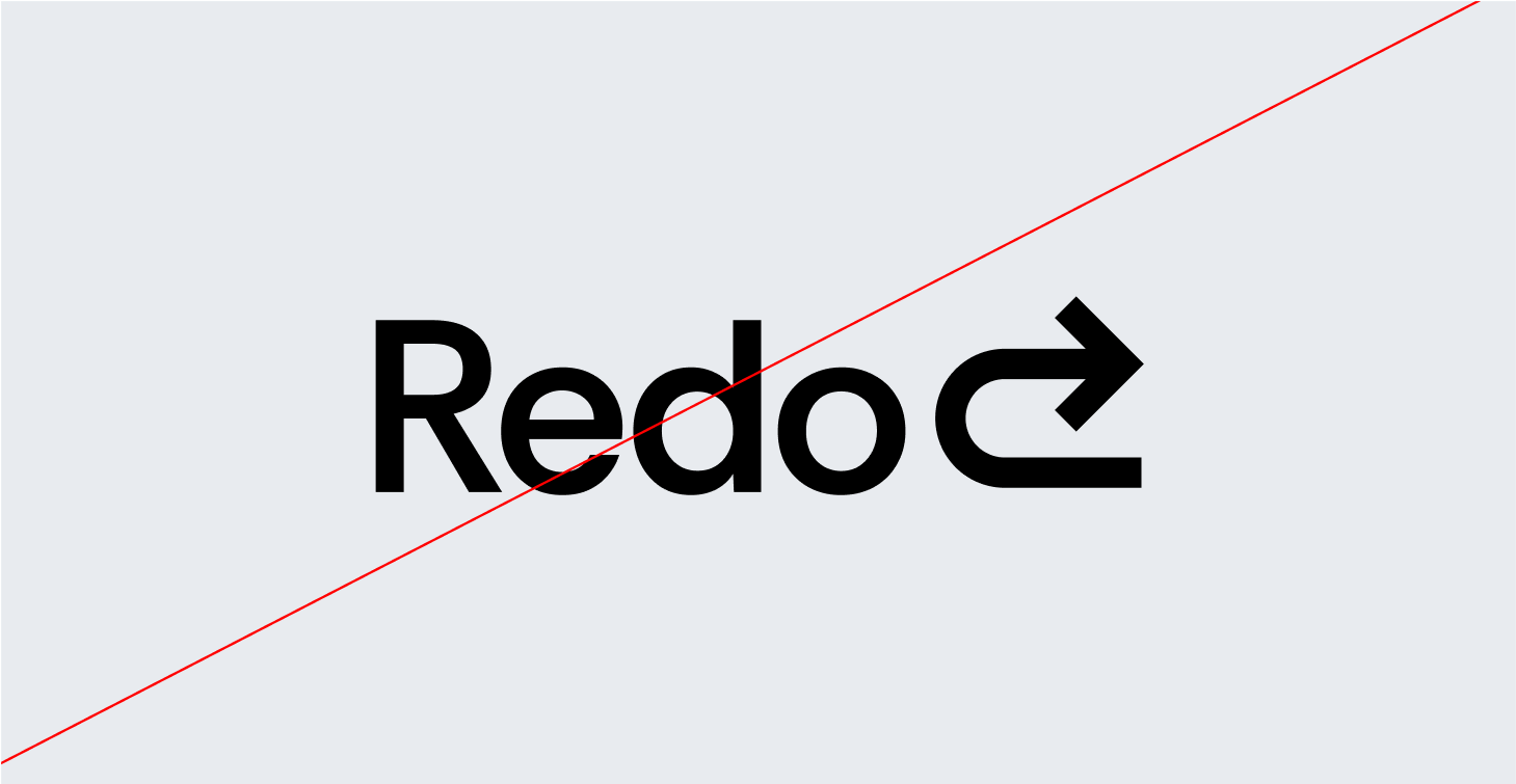
Do not outline the logo
Do not reverse the lockup
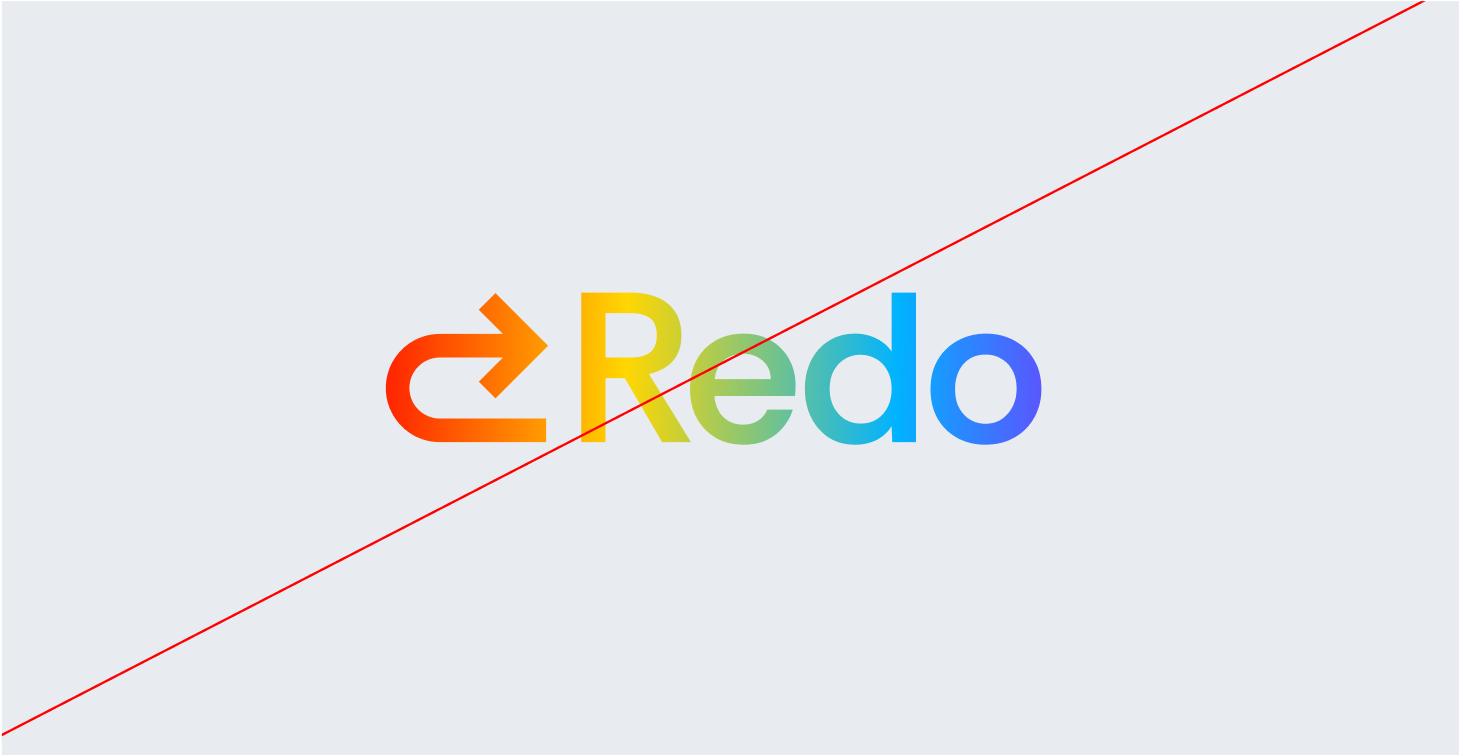
Do not add gradients the logo
Partnerships
04 Color
GrowWell’s color palette is designed to evoke trust, reliability, and financial clarity, ensuring that every touchpoint reflects our commitment to accuracy and efficiency.
Together, these colors create a strong, dependable, and forward-thinking brand identity, ensuring that GrowWell is instantly recognized as the go-to solution for financial corrections and optimization.
Primary Palette
Rich Navy
Hex: #1C2A4A
Light Navy
Hex: #56A1D8
Sunny Cream
Hex: #FFF3C1
Baby Blue
Hex: #C6EBF7
Secondary Palette
Vibrant Lime
Hex: #8CBD22
Bright Tangerine
Hex: #EE7D4A
Sky Blue
Hex: #DEEEFE
Off-blue
Hex: #E8EBEF
Power Blue
Hex: #4E89D9
Black
Hex: #000000
Dark Grey
Hex: #A3A3A3
Grey
Hex: #E5E5E5
Gradient Palette
Gradient 1
Gradient 2
Gradient 3
Gradient 4
05 Typography
GrowWell’s typography is designed to balance expert reliability with warm accessibility, mirroring our holistic approach to early childhood development. It acts as a visual bridge, reinforcing our commitment to trust, education, and positive change.
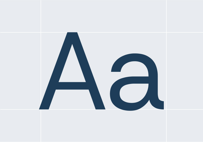
Lust is the primary font we utilize as a modern, lowercase wedge-serif to anchor our brand. It is characterized by high contrast between thick and thin strokes, graceful, sensual curves, and a confident, deliberate personality that channels traditional Scotches and Didones with a modern, expressive twist. The series is often described as a "typographic guilty pleasure" or an "exercise in indulgence," with letterforms that are both familiar and playfully provocative. The serif details convey the professionalism and authority required to speak credibly to educators, while the lowercase styling ensures the brand remains friendly, casual, and approachable for parents and children.
Primary Typeface
Lust
Secondary Typeface
Montserrat
Sizing
Through a consortium of partners from Croatia, Serbia, Belgium, and Ireland, including an EdTech company, a university, a kindergarten, an NGO, and an educational institution, we will research and compare Social and Emotional Learning (SEL) curricula across partner countries
Building confident, healthy children.
Type Sizes > 72pt/px
100% Leading
-2% Tracking
We will pilot and test the 12 educational toolkits, combining animations and downloadable materials.
Type Sizes 55–72pt/px
110% Leading
-2% Tracking
Educators, parents, and guardians will be trained on mindfulness, well-being, and using SEL resources in classrooms and at home to help children build resilience.
Type Sizes 24–55pt/px
120% Leading
-1% Tracking
A structured training and dissemination strategy will ensure long-term impact and sustainability. At least 100 educators and 300 parents will participate in SEL training sessions, supported by a Train-the-Trainer program preparing 15 local trainers to deliver SEL training beyond the project’s duration. Feedback from implementation will guide improvements to materials and methods.
Type Sizes 0–24pt/px
130% Leading
0% Tracking
06 Art Direction
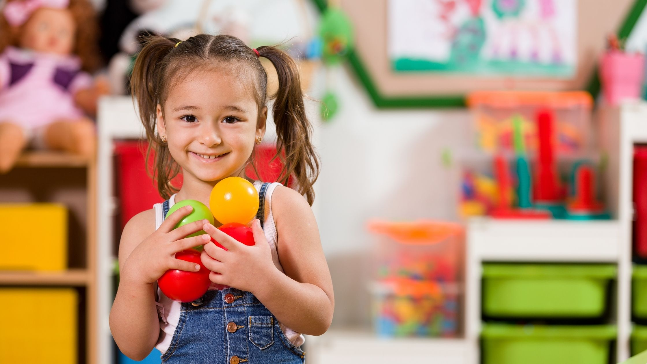
Grounded Optimism Our visual world is bright, authentic, and deeply human. It rejects the sterile look of clinical psychology and the chaotic primary colors of generic preschool brands. Instead, we visualize growth, connection, and emotional intelligence through a lens that is "Safe," "Trustworthy," and "Enthusiastic".
Grounded Optimism Our visual world is bright, authentic, and deeply human. It rejects the sterile look of clinical psychology and the chaotic primary colors of generic preschool brands. Instead, we visualize growth, connection, and emotional intelligence through a lens that is "Safe," "Trustworthy," and "Enthusiastic".
Every image should tell a story of empowerment—showing children, parents, and educators as active agents in their own well-being.
Every image should tell a story of empowerment—showing children, parents, and educators as active agents in their own well-being.
Candid & Authentic
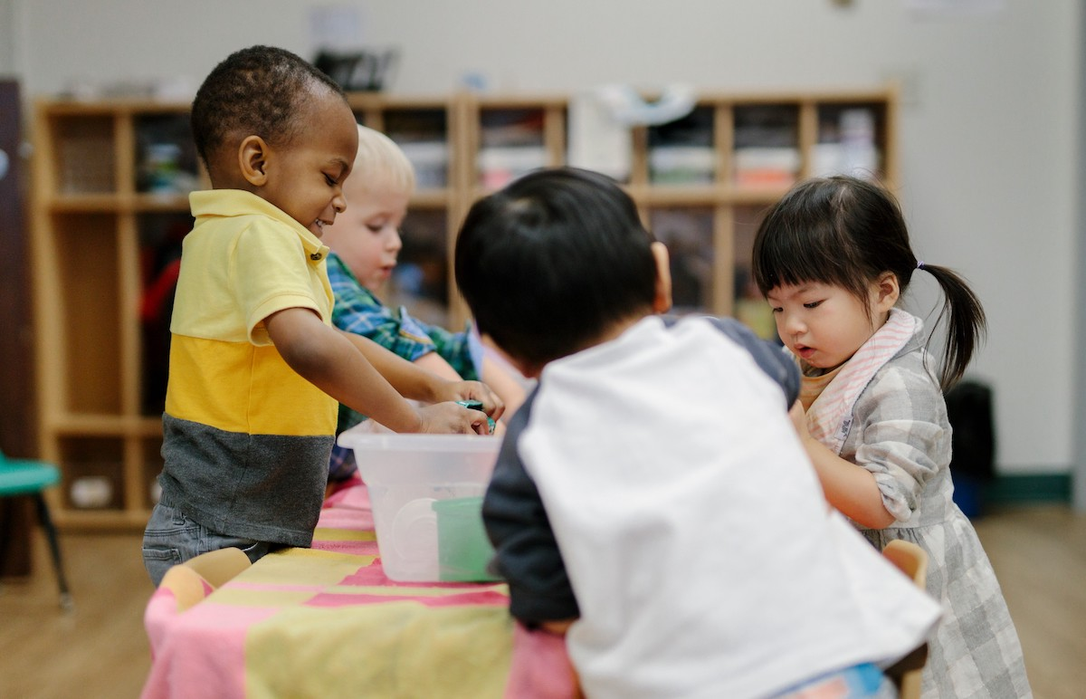
We capture real moments of connection. Avoid stiff, "camera-aware" posing. We want to see the "spark" of understanding or the comfort of a supportive gesture.
Eye-Level Perspective
When photographing children, we shoot from their height/eye level. This visualizes our value of "Respect" and giving children "Agency". We do not look down on them.
Emotional Range
While the brand is "Positive" , it is also about Social-Emotional Learning (SEL). Images can show focus, curiosity, calmness, and cooperation—not just exaggerated happiness.
GrowWell is for everyone.
Diversity: Our imagery must authentically represent diverse abilities, ethnicities, and family structures.
Accessibility: Visuals should include representations of children with different needs engaging with the tools, reinforcing our commitment to "Accessibility & Practicality".
